James Porter

Data Analyst Portfolio
View My LinkedIn Profile
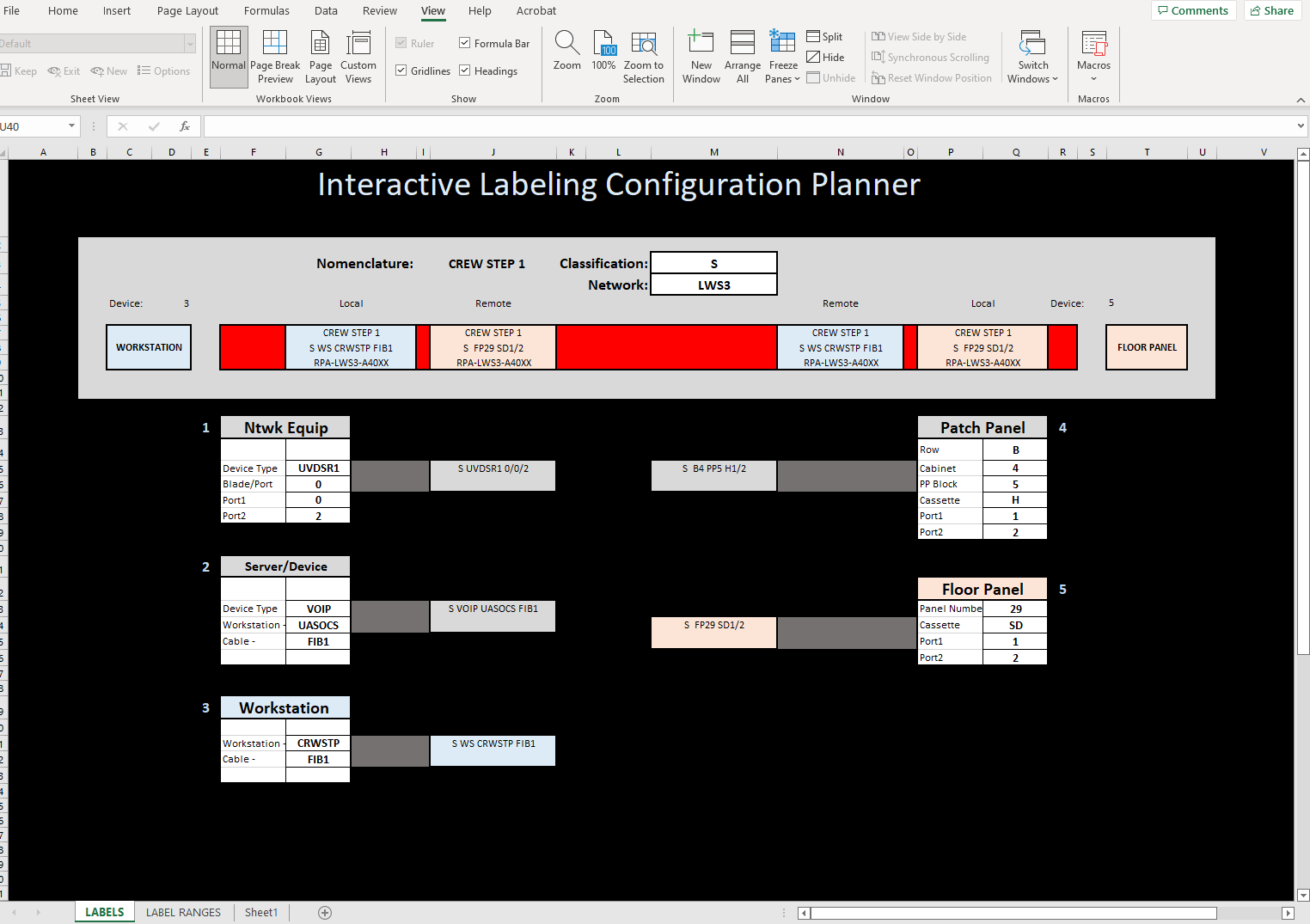
Interactive Labeling Configuration Planner
This project was developed out of the need for an easier way to visualize labeling rules for a server room. The server room that I was working with was undergoing an extensive remodel/upgrade which entailed a lot of equipment replacement. This required a complete shuffeling of our rack space in order to accomodate the new equipment. This meant that we needed to re run a large assortment of various cabling. The contractor doing the install needed the cabling ran prior to the equipment installs and needed the local team to label the cables according to their labeling schema. The schema was overly complex and the team needed a way to simplify the process so that they could all be making cables the same way and consistent with the install teams requirements.
https://github.com/James-E-Porter/james-e-porter.github.io/blob/main/Interactive%20Labels.xlsx
1. The Planner
With a need in place, I went about designing an interactive excel sheet that would take user input and show a visual of what the labels were suppose to look like.
2. The Process
I built the initial document in excel. My familiarity with the software allowed me to establish a framework rather quickly. VLOOKUP tables seemed to be a great tool in forming my interactive setup. They allowed me to have selections that would fill in different data in other parts of the document.
3. Implementation
The install team had a very specific way that they wanted labeling to be done. They wanted the cable to have two labels on each end. The label closest to the end would be the local equipment, the next label would be the equipment at the far end of the cable. The labels would then be reversed on the other end. So starting at the top of the document the first box you can change is the Classification box. This box actually controls conditional formatting on the color of the sample cable. This is a reminder to the team what color cable to use. The network box is used to identify what equipment grouping the cable falls into. These groupings were broken up to keep things manageable. Next we have the actual diagram that is the sample cable. There are boxes at either end of the cable representing the type of equipment/panel that the cable plugs into. This is selected by number in the Device pulldown. The number correlates to the five boxes underneath the cable sample. The cable sample itself has (in order) a light blue local label, a light red remote label, a light blue remote label, and a light red local label. The light blue labels are identical as are the light red ones. These label boxes are automatically filled in based on the choices selected in the boxes below the cable sample. The five boxes on the lower half of the dashboard are used to fill in data about he particular piece of equipment or panel that the cable is going to be used for. The five different types were selected because each of these types had different information that needed to be conveyed on the label. The box to the side CONCATENATEs the selections into a proper label format.
=CONCATENATE(M3," ",G15," ",G16,"/",G17,V16,G18)
The VLOOKUP on the cable sample pulls that information into the right place.
=VLOOKUP(D5,Sheet1!B22:D26,3,FALSE)
All the tables used to stor the data was placed on a seperate tab (sheet1) This kept it all in one place making it easier to manipulate. In the future I would label those tables to make them more apparent as to what they were used for. This would make the whole document easier to interpret if someone needed to dissect what I had done.
4. Conclusion
Overall the team was very receptive to the document and it has been a valuable tool in our labeling process. A the time of writing, 90% of the labeling has been done and the entire process took almost a week less than anticipated, in part due to the ease at which the team could identify what labels needed to be printed.